Can AI art get better? Rin thinks so
01.11.2026
During Next Fest a Chinese creator, Rin, reviewed the Larithea demo. Claude translated it for me (I have to trust Claude on this one). The art, Rin says, is obviously AI, you can tell at one glance. And then: because it is AI, it can get much better, there is a lot of room to grow. Also Rin really liked Maya. Thank you, Rin, I like her too!
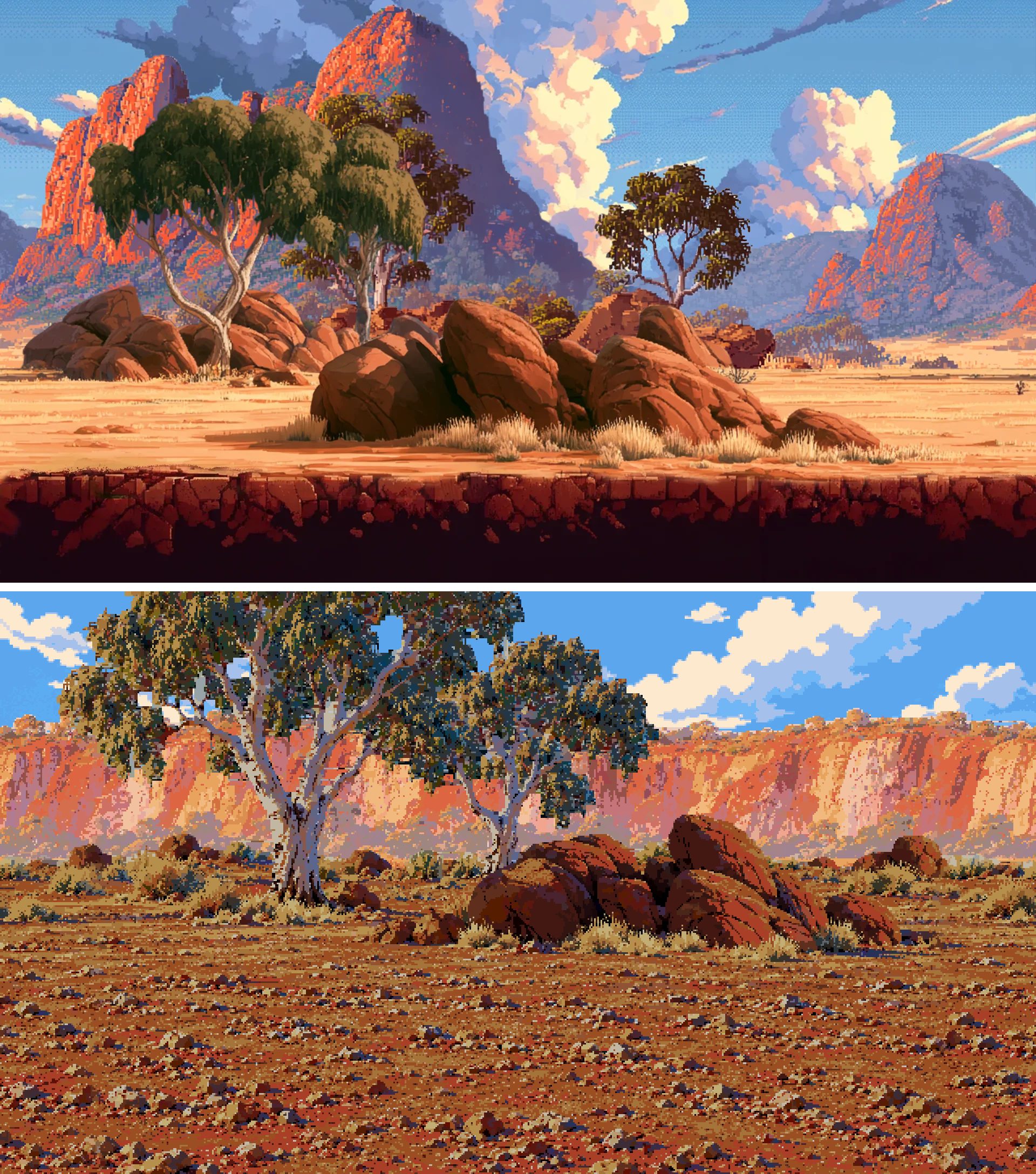
My dream was always to find an artist to work with. But I am self-funding this game, so AI had to do. And Rin is right, you can see it. Every background came out of a different Scenario run, and together they looked like five different games. Different light, different textures, even different ideas about shadows.
Could I make the images better, make them look like ONE game, and not spend thousands of credits regenerating everything until something sticks?
The answer turned out to be Python. (Of course it did.)
It is the same idea I used for translations. Let the AI do the creative part, then make everything after it deterministic. Claude and I built a little tool, the Style Normalizer, with no AI inside at all. It takes any image and does exactly the same things to it every single time: shrinks it to the pixel grid, maps every colour to one shared palette, cleans up stray specks. Same image in, same image out, every time, which an image model will never give you. I love it.
Scenario still makes the base. Each background gets restyled from three images: a layout template so the floor and the hero's size are always the same, an approved background for the style, and the old art or a photo of a real place that inspired the map piece. Two versions per run, I pick one. Then the scripts take over, and scripts are free.
And then the iterations started.
Style first. We wrote down what the style is (dense small texture everywhere, cool blue-violet shadows), and then I spent days rejecting things. A camp that looked like a clean vector illustration. Caves with big black blobs. A desert camp with a checker pattern nobody asked for. Lilac shadows. And the skies! We made beautiful detailed skies with gorgeous clouds, and they were TOO MUCH. Now every sky has about seven colours, and the clouds stay at the top.
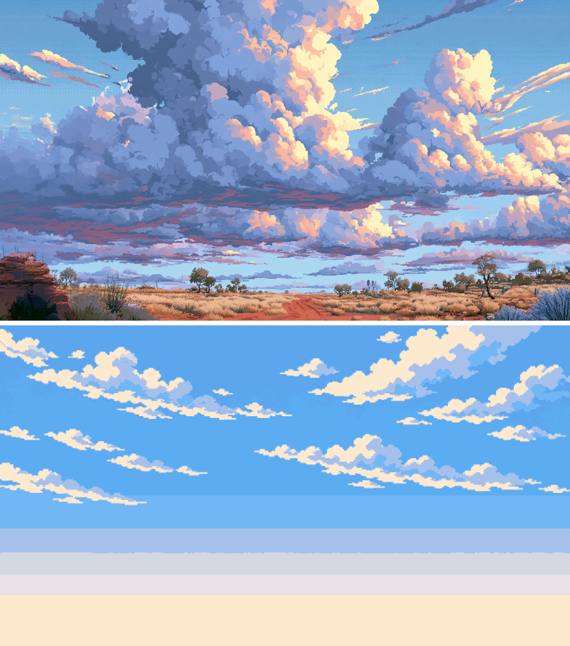
Then light. A walking scene has layers: the sky, a back that moves slower, and a mid the heroes walk in front of. If the back and the mid are equally bright, everything goes flat and the heroes get lost. So the mid got darker and sharper, and the back softer. The caves were too dark, so we brightened them. The temple had the opposite problem: the first version looked way too celebratory for a place where you fight for your life. So it got darker and more violet. And then all the glowing mushrooms disappeared in the dark, and Claude had to write one more script just so the mushrooms could glow again.
And then transparency. Every mid layer needs the sky cut out, so the game's own sky can show through. Scenario gives me a white sky, a script cuts it out. It cut out the trunks of the ghost gums, because ghost gums are white. It left white rims around every window. In the caves we generate the openings in bright green and cut the green out, until one pool reflected the green and the water started to go too. The bush fire smoke needed to be half see-through, and the first try made the whole forest half see-through instead. Now every layer gets checked on bright pink, so any hole screams at you, and I still do the last clean-up in Photoshop myself.
So, did it work? Every walking scene in Chapter 1, the skies and the town screens have new art. The only expensive part was the Scenario runs. All the fixing after that cost nothing.
The new art goes into version 10 next week. Next on the list are the heroes' animations and icons. That will be much harder. But I will try anyway.